
Every organization claims to be data-driven. Few ask what's driving the data. And when a data-driven decision fails, the phrase becomes its own defense: the data said so. No one asks which data, weighted by whom, measured against what outcome — because the reasoning was never visible in the first place. "Data-driven" without a framework isn't a discipline. It's accountability theater.
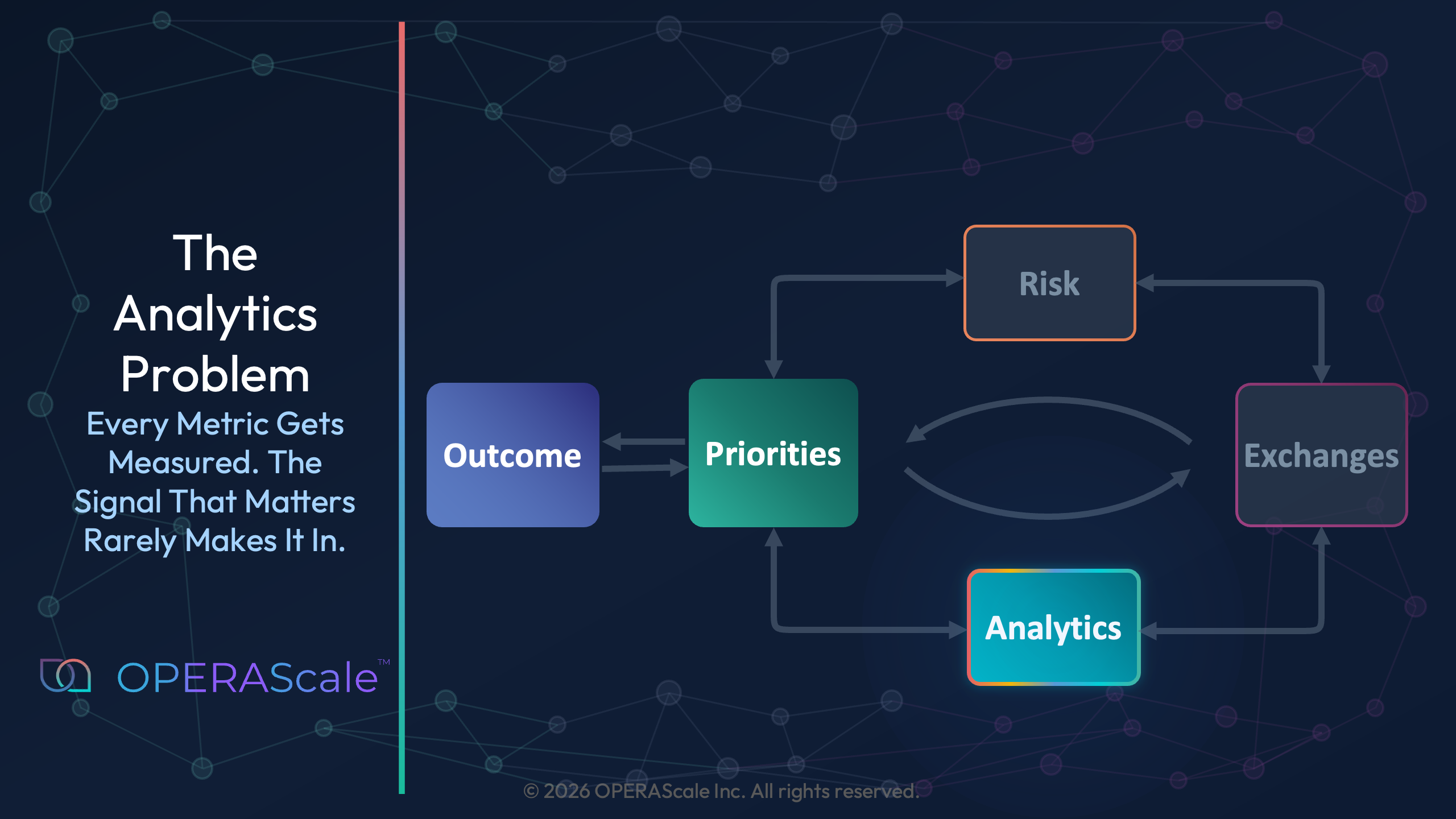
The previous articles made the first two invisible elements of a decision visible: the outcome and the priorities. This article turns to analytics, where the gap is hardest to see — because the numbers are everywhere, and the signal is nowhere.
The signal fails to enter the model in four distinct ways - each one sufficient on its own to break the decision. The dashboard isn’t asking the right questions, so it can’t receive the right signal. The live signals from the people closest to the work have no structured way to get in. The qualitative weight each person’s judgment carries has no standard place in any model. And the logic is buried so deep in the model that no one can challenge it. So the model wins by being unreadable rather than right.
And when organizations race toward AI to close that gap, they discover the hardest truth of all: AI doesn't fix the signal problem. It inherits it — and worsens it.
Built to Report, Not to Decide
Most organizations invest heavily in dashboards. Tools like Tableau, Power BI, and Looker promise to make data visible — and they do. But visibility is not the same as legibility. You can build a dashboard with 47 metrics and still have every stakeholder interpret them differently. The signal is there. The structure to read it isn’t.
Just last month, Harvard Business Review published Why Your Digital Investments Aren’t Creating Value which cites a 2025 PwC survey:
Why? – because most organizations measure digital success by the wrong standard — "systems deployed, users trained, dashboards accessed." The problem, they conclude, is that "success shows up not in activity metrics but in outcomes." The dashboard gets built. The decision doesn’t improve.
This points to the deeper problem: metrics are often chosen before the outcome is defined. Teams build models around what they already know how to measure, not around what the decision requires. The result is a dashboard that answers questions nobody asked — and goes silent on the ones that matter.
The Invisible Signals
What the Dashboard Can’t See
Every person in your organization carries signals that don’t fit in a spreadsheet cell. The analytics problem is that the most important signal often isn’t in the analysis at all — not because it doesn’t exist, but because no structure was built to receive it.
Metrics are inherently lagging. By the time a pattern shows up in a dashboard, the event that caused it has already happened. The people on the ground — the ones inside the work — often know what’s coming before any metric can surface it. They carry live information. Dashboards don’t give them a way to contribute it.
This is what I discovered while developing a risk-based prioritization algorithm for the FAA to sequence aviation safety inspections. The quantitative elements were straightforward — inspection frequency, incident history, fleet age. But the strongest predictors of safety weren’t in any of those metrics. They were in the humans closest to the work: Did pilots get enough sleep before a flight? Was a safety concern communicated across crew transitions, or quietly swallowed?
The data could only tell us what had already gone wrong.
OPERA addresses this directly. The framework isn’t built to wait for the lagging indicator. It creates a structure where the people closest to the work can surface what they’re seeing — as a named input that sits alongside the quantitative data. Not after an accident. Before it.
The Factors The Decision Maker Knows and Models Don’t Show
I built cost models that ranked the efficiency of different clean-energy technologies for the US EPA. The rankings were quantitatively defensible. But the model couldn’t tell us which option would be chosen — because each stakeholder considered priorities that the model didn’t capture:
- Regulatory Affairs Lead — policy durability
- CFO — stranded asset risk
- Facilities Manager — workforce readiness
- Board Member — reputational value
The cost model was the same for all of them. The decision wasn’t.
OPERA closes that gap by giving each stakeholder a structured way to surface their qualitative priority — not as opinion, but as a named, visible input that sits alongside the cost model. The regulatory lead’s concern about policy durability is seen in the same view as the CFO’s cost projection. The decision maker sees the full picture — not through intuition, but through structure.
The Logic Is Not Transparent
Even when the signal does make it into the model, another problem surfaces: no one can understand it. Transparency is not guaranteed. If you print your spreadsheet, people should be able to follow along. That was the standing challenge from my first manager, Andy Knox — Harvard Kennedy School graduate and CFA. The discipline: keep every cell formula short, simple, and readable. A×B=C. A÷B=C. No exceptions.
We put that discipline to work on a financial model that calculates interest rates for the Nuclear Waste Fund — a multi-billion-dollar portfolio managed in partnership with a Wall Street firm. What we inherited was a spreadsheet with 20 tabs and cells containing formulas—some 20 lines long. No exaggeration. With Andy’s guidance, we reduced it to 5 tabs. When reviewed by fellow consultants, Wall Street managers, and the client, they understood it intuitively. The same model was later adapted for multiple other projects by teams that were not involved in building it.
Picture the meeting. A complex model goes up on screen, and only the analyst who built it can follow it. Everyone else nods. No one pushes back — not because the logic is sound, but because no one can quickly understand the logic well enough to challenge it.
The model doesn't win because it's right. It wins because it's unreadable.
That's a debate failure, not an analytics failure. When logic is buried in formulas rather than expressed in structure, it shuts down the room. Assumptions go unquestioned. Inputs go unchallenged. The decision belongs to whoever built the black box — until they leave, and it belongs to no one.
At the organizational level, the stakes are higher. When the analytics behind a decision can’t be followed, they can’t be challenged, refined, or built upon. They sit in a black box that only their creator can open. And when that person leaves, the decision logic leaves with them.
Simple models, clear assumptions, and narrative clarity outperform complexity. But even when the logic is legible, a separate failure persists: the metrics still don’t talk to each other. You can have a readable model and still have no map.
The Linkages No One Drew
Modern organizations lack linkages showing how the numbers relate to each other — and how each metric connects to the outcome everyone said they were optimizing for. A labor cost metric that isn’t linked to a schedule isn’t a cost model. It’s a cost fact. A satisfaction score that doesn’t connect to a retention trend isn’t an insight. It’s a snapshot. Individual metrics report what happened in one place, at one time, in one silo. Linked metrics reveal the system.
I built exactly this kind of map for the Department of Defense — enterprise-level schedules across multiple programs, condensed to a single page so senior leadership could see every key milestone in one view. It worked. Leadership could finally see the schedule. What they still couldn't see was how it connected to everything else the decision required — cost, risk, the options being weighed, and ultimately the outcome. Those lived in separate systems.
Working with Fortune 500 companies, I found the same gap: most project management tools connect tasks to timelines, but not to the tradeoffs required to actually make a decision.
This is where the invisible drivers — the priorities surfaced and modeled across stakeholders — become essential. When those drivers are visible, the data question shifts from “what can we measure?” to “what does the decision require?” If a factor is missing from the surfaced priorities, it usually means the people who hold that knowledge aren’t in the conversation.
The A in OPERA isn’t about having more data. It’s about building a structure where the numbers inform each other — where you can trace a thread from a metric back to the outcome, and forward to the tradeoff it reveals.
Analytics without linkages report the past. Analytics with linkages navigate the future.
AI Inherits Every Signal You Missed
There’s one more failure hiding beneath all four. Organizations are racing toward AI transformation — but the inputs feeding those systems carry the same invisible signals as the manual models. A model trained on fatigue-incident lagging indicators doesn’t learn pilot fatigue. It learns the proxy. AI doesn’t fix this incomplete signal problem. It inherits it — and worsens it. A model trained on incomplete inputs doesn’t produce better decisions at speed. It produces worse ones with more confidence. OPERA is the decision architecture that makes AI inputs defensible. Structure first. Tooling second.
What Comes Next: Making the Invisible Signal Visible
Four aspects of the same invisible signal run through every failure described above. Metrics are lagging — humans carry live information that dashboards were never built to receive. Qualitative factors carry real weight in every decision, but no standard model gives them a place. Model complexity shuts down debate — when only the analyst who built the model can follow the logic, no one can challenge the assumptions. And metrics that aren’t linked to each other, or to the outcome, report the past instead of revealing the system.
In every case, the signal existed. What was missing was a structure to receive it. These are not technology failures. They are structural ones.
The Priorities Solution article made the invisible what’s important visible. The next article makes the invisible signal visible — how do you take priorities, some qualitative and some quantitative, and make them legible as analytics? Most organizations stall at exactly this fork.
OPERA gives both a structured place and puts them on the same playing field, so they can be compared, challenged, and connected to the outcome.
To explore how the OPERA framework applies to a decision you are working through right now, reach out at hello@operascale.com.
About the Author